Take-aways
1. Orient honestly
To do this ask:
- Where are we now
- Are we all in the same place? Do we have the same understanding?
- What makes this moment complicated?
- What is the uncomfortable truth that I’m not allowing myself to see or accept?
2. Value outcomes
When you value plans more than outcomes it’s easy to mistake effort for achievement.
3. Leverage the brains
You only need three kinds of people in any decision meeting: the people with the authority to say yes, the people with the information or expertise, and the people who have to live with the outcome. If this means leaving out lots of people from a decision team, then think of it as representative rather than direct democracy, says Janice.
4. Make durable decisions
Eliminate waste by changing your standards. Two kinds of waste come into decision making, says Janice – decisions can either be very slow or made quickly but chaotically. In the latter case this is because they may be made unilaterally, made by the wrong people, or with no commitment from others. While such decisions may be fast, productivity will be slow, Janice says.
Durable decisions should balance speed and strength. Two sentences to look out for here are “Can you live with it?” and “Does it move us forward?”, says Janice, these are different from “Do we all agree?” and “Is it the best?”.
“I think most drama comes from difficulties in decision-making,” Janice concludes. “I think decision making is a leadership skill. If you can facilitate great decision-making in a great decision-making process by bringing this more realistic framing to it, then you’re going to improve the culture of your organisations tremendously.”
Summary
Orient honestly
Vision
Point A and point B. Where are we now? Where do we want to be? Relates to Vision.
What makes a good point A? You need to be brutally honest about your status quo. Include any disorder or messiness. Be sure to capture your hardest win, most durable markers of progress, points of tension, messiness, and uncertainty.
What makes a good point B? Point B should be specific enough to guide your actions, but not so specific that it points you towards a single possible outcome.
Outcomes
Concrete and measurable goals are mostly framed as outputs: writing a book, hitting a sales goal, losing weight. When we orient around outcomes we define what we want to have, change, or be, and put loose parameters around that. We decide on an ideal end-state that could come to pass in a variety of ways.
| Be happy going to work in the morning. | Quit job/company. | New job & company. | |
| Have less stress, drama, conflict. | Find a new situation; talk with supervisors. | New role at same company; new project with different team. | |
| Manage or mitigate the dysfunctional situation. | Build relationship with coworkers. | Support within current role. | |
A tool for finding the truth: Five times why
Self deception: we don’t know everything. What do I know? How do I know it?
How do we know we’re not honest to ourselves?
| 1 | WHY is there no coffee in the coffeepot? | Because we’re out of coffee filters. | |
| 2 | WHY are there no coffee filters? | Because nobody bought them at the store. | |
| 3 | WHY didn’t someone buy them on the last shipping trip? | Because they weren’t on the shopping list. | |
| 4 | WHY weren’t they on the shopping list? | Because there were still some left when we wrote the list. | |
| 5 | WHY were there still a few left when we wrote the list? | uhhhh? | |
A hyper dynamic world
The OODA loop makes it easier for individuals to decide which actions to take in dynamic situations.
OODA loop example:
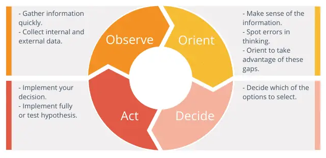
Observe: based on many inputs, each day an air mission plan is released that describes what each combat plane will be doing the next day.
Orient: Once the plan is released, a tanker planner team evaluates the needs, assesses where tankers will be needed, and at what exact times in order to keep the combat planes on-mission.
Decide: tankers and personnel are allocated to each of the specified coordinates.
Act: each morning, a tanker plan is submitted for the day’s sorties.

Value outcomes
Everyone takes it on faith that if we execute our little portion of the plan according to the items that were specified up front, then we will necessarily have done the right thing and have delivered the value. When you value planning above outcomes, it’s easy to conflate effort with achievement.
Outcome oriented roadmap
- It you spend time doing it, it’s an activity.
- The tangible result of that time spend is an output.
- The reason for doing those two things is the outcome.
People involved in creating an OORM:
- People with the authority to say yes;
- People who have relevant knowledge;
- People who have to live with the outcome.
Tests to bulltproof the OORM:
- Are the outcomes clearly articulated?
- How good are your metrics?
- Have you articulated risks and mitigations?
- Does your roadmap represent an aligned viewpoint?
- Is your roadmap easy to discover and consume?
Making outcomes actionable
Provide just enough direction.
OGSM: Objective, Goals, Strategies, Measures.
OKRs: Objects, Key Results
V2MOM: Vision, Values, Methods, Obstacles, and Measures.
Leverage the brains
Leverage the brain in three steps:
- Frame the problem
- Get the right people in the room
- Respect your collaborators
Externalize, Organize, Focus
Externalize (go-wide): the first step is putting as much of the situation as possible into physical space, so that people can literally see what’s going on in each other’s heads. In most cases, externalizing means writing down our thoughts our ideas where others can see and understand them. This can be, for example, in a narrative (Narratives).
Organize (now, decide): next, we make sense of the undifferentiated mess of items we’ve just externalized. The most common approach to organizing is to group items, ideas or subjects into logical sets, for example, by type, urgency, cost, or any other criterion.
Focus (prepare for action): we need to decide what matters based on the organizing. We need to interpret the significance of each group and let that guide us in a decision.
Reinventing “the meeting”
Definition in 1976: A meeting is a place where the group revises, updates, and adds to what it knows as a group. We didn’t have computers, email, text, or video in 1976, so this made sense. Our options for communications and collaboration where very limited, so this was the only efficient format.
Tips on how to run a modern meeting:
- Switch up language: let’s move from “agenda” or “topics to discuss” to “work plan”. Let’s stop using “meeting” but use “decision session” or “work session” instead. These small language tweaks set different expectations for how the time will be spend.
- Frame the meeting with an AB3: explain point A (start of the meeting) and point B (end of the meeting), and three agreements / methods that you will use to move from A to B.
Make durable decisions
Questions:
- It this a decision we can all live with?
- If we went in this direction, is that something we could all live with?
These questions widens the aperture of possibility, while reducing the chances that someone will back out later.
Decision-making process
Steps in the decision-making process:
- Notice there is a decision to make;
- Gather inputs (costs, potential solutions, time frame);
- Weighing options (pros and cons);
- The moment of choice;
- Resourcing (who is going to execute?)
- Execution.
It’s fine to move back into a previous step if this feels right.
Durable decisions
- Avoid absolutes (find a good enough decision instead of the “right” decision);
- Get the facts right (to move quickly, first gather facts and inputs);
- Consent, not consensus (agree to disagree);
- The right people, but not too many (people with the authority to say yes, people who have subject-matter knowledge, people who have to live with the outcome);
- Reduce the scope (break down large decisions into incremental moves);
- Mental agility and growth mindset required (if stakeholders come with their mind made up, it will be a difficult discussion).
UBAD
Understanding: stakeholders need to understand what it is you’re proposing. Any decision that is made without understanding is highly vulnerable;
Belief: once a stakeholder understands your thinking, you need to help them believe in it. That means hearing objections, exploring concerns, and satisfying curiosity;
Advocacy: when someone is putting their social capital on the line to spread the idea, you know that they must truly support it;
Decision-making: are stakeholders making decisions in support of the idea? This represents the most enduring form of support.