
Product Managers love data. Therefore, being able to create your own reports to track the KPIs relevant for your products is really useful. One of the KPIs you might run into relates to the Pareto principle, for example, 80% of the revenue needs to come from 20% of the customer base.
The Pareto principle
I’m going to refer you to the wikipedia for the extensive explanation. I will give you a couple of examples:
- 20% of the customers should account for 80% of the revenue.
- 20% of the richest persons in earth account for 80% of the income.
- 20% of Italy’s population owned 80% of its land.
The Pareto principle in Power BI
We take a couple of steps to get this visualised in Power BI:
- Prepare the data structure.
- Adding a rank to the data based on a specific category.
As an example I’m using the KPI that 80% of revenue should come from 20% of the customers.
Data preparations
I recommend you to create a table to put the data you want to visualise on the screen. This makes it easy to validate the results of the measures you create.
You need two types of data to visualise the Pareto principle in Power BI:
- Category: this can be, for example, a customer or country.
- A number: this can be, for example, the sales of a customer or country.
Ranking your customers
You first need to find the top 20% of your customers. You should create a measure that calculates the rank of the customer depending on the sales value.
Rank = RANKX(ALL(Sales[Customer]), CALCULATE(SUM(Sales[Sales_Value])))When you add the Rank measure to your table and sort it by sales value, the customer with the highest amount of sales should have rank 1.
Cumulative sales
Now that we have ranked your customers, we want to calculate the cumulative sales. This measure cumulative sales of the customer with rank 1 is the sum of the sales of customer 1. The cumulative sales of customer 2 is the sum of the sales of customer 1 and customer 2.
(use SHIFT+ENTER to create a new line in DAX).
Cumulative_Sales_Value =
var currentRank = [Rank]

RETURN SUMX(FILTER(ALL(Sales[Customer]),[Rank]<=currentRank), CALCULATE(SUM(Sales[Sales_Value])))
Total sales
To calculate the stake of the cumulative sales of a customer in the entire revenue you need to calculate the total sales value. The ALL function applies the selected filters.
Total_Sales = CALCULATE(SUM(Sales[Value]), ALL(Sales[Customer]))The last measure you need to create calculates the cumulative sales (in % of total sales). You will use this measure to create the line in the visualisation of the Pareto principle.
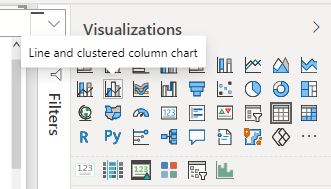
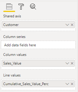
Cumulative_Sales_Perc = [Cumulative_Sales_Value] / [Total_Sales] * 100Create a line and clustered column chart
Now you are ready to add the measures into a line and clustered column chart.
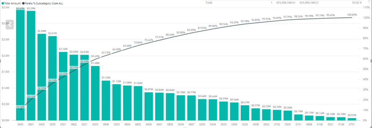
The result:
